Behind many aspects of financial and economic analysis, sits the unsung hero that is the yield curve. On paper, a yield curve is simply the result of plotting the yields or interest rates of numerous similar instruments across different maturities into the future, but they play a vital role in interest rate forecasting, economic analysis, borrowing and investment appraisals, and many other facets of treasury management.
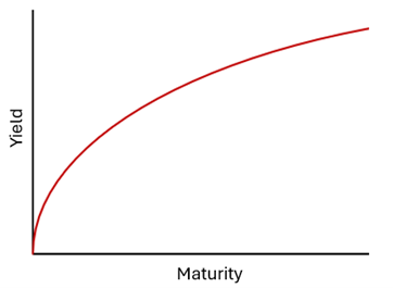
To start at the beginning, when discussing yield curves the constituent instruments that go into their creation tend to be bonds of similar credit quality such as bonds issued by the same government, or a curve made up of lots of similarly credit rated bonds. From here, you would require both the yield of the bond and the time to maturity which make up the two axis of your graph and leave you with a yield curve that, in many cases, will look like this.

This is what would be a called a normal yield curve or, more accurately, an upward sloping yield curve. It implies that as the time to maturity increases, investors demand a higher yield for the same credit quality bond. This makes sense as there is what is called a term premium applied to investments, meaning that if it can’t easily and quickly be converted into cash (as would be the case with a long-term bond), the yield will need to be higher in order to compensate for this.
This is not the whole story, however. Readers may cast their minds back to the last few years and wonder where this term premium on their investments disappeared to? For quite some time now we haven’t had a normal shaped yield curve because term premiums are only one factor that can affect the yield curve with another major one being interest rates and interest rate expectations.

One of the other key factors that can affect the shape of the yield curve is the market’s expectation for future interest rates. The charts above roughly mimic the United Kingdom Sovereign yield curve which is made of different UK government gilts of various maturities. In an environment where interest rate expectations are relatively stable, the curve slopes upwards at different steepness depending on how strong the economy is. Over the last four years, the economy has gone through a shift from ultra-low interest rates to much higher interest rates due to rising inflation since the Covid-19 pandemic.
As the economy began to open up in 2021 and 2022, the yield curve drifted upwards as investors became concerned about pent up demand leading to rising inflation. These concerns intensified in 2023 when inflation began to spike sharply, with the UK sovereign yield curve jumping up briefly before flatting in the long-term. This created what is called a “humped” yield curve due to the quick rise and fall. This was because investors knew the Bank of England would have to raise interest rates in the short-term to combat rising inflation but that they would not stay elevated as the economy weakened, hence the falling tail-end of the curve.
In 2024 the curve was inverted, meaning that yields were currently high and fell on the long end. Investor expectations had shifted and suggest that we are at a peak for interest rates which are now expected to fall, hence the falling yield curve in the short-term before plateauing as interest rates reach a new equilibrium on the long-term.
Yield curves form an important part of our analysis for economic forecasting as it is helpful to see where markets makers are placing bets for future interest rates. They are of course not without their flaws, for example the market often tends to overdo its reaction in one direction or another. The yield curve moves day to day based on new data releases, geopolitical developments, and every Jay Powell speech/tweet.
On the other hand, the Arlingclose forecast remains static between Monetary Policy Committee meetings and therefore must take a longer-term view that cuts through some of the noise that markets generate day-to-day. Our forecast has been unchanged since September 2023 and correctly forecasted the quarter where rate cuts would begin.
As things stand, the yield curve remains inverted with the yield on a one-year bond well above the yield on a five-year bond. Markets have been pricing in rate cuts over the remainder of the year, a sentiment that has only been strengthened since Andrew Bailey’s recent comments suggesting rate cuts could be more aggressive than previously expected provided wider geopolitical risks don’t re-stoke inflationary pressures.
In the next part of this insight series, we will explore some of the other types and shapes of yield curve and their various uses in treasury management. If you want more information on our economic and interest rate forecasting services, please email treasury@arlingclose.com.
Related Insights
The Rise of Company Insolvencies in England and Wales
The Benefits of Capitalising Interest Costs During the Construction of an Asset